


Color.review
A modern tool for exploring and finding accessible colors. Make sure that everyone can see your creations.
About Color.review
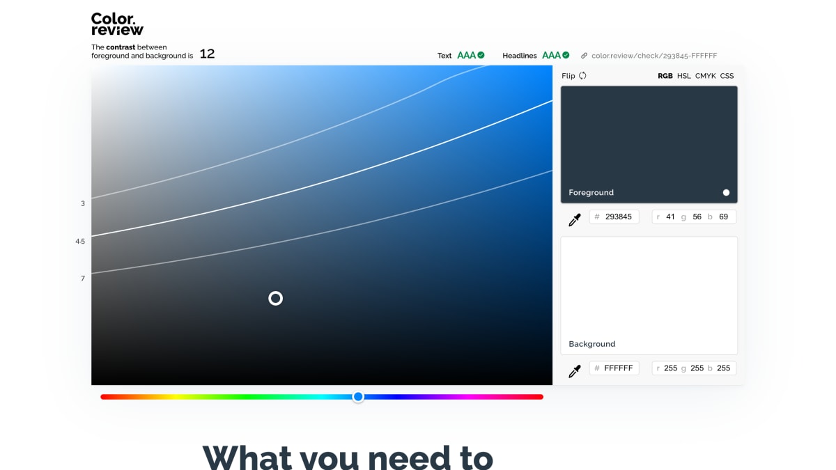
Color.review is a web-based tool for checking the contrast between a foreground and background color, expressed as a numeric contrast ratio. Colors can be entered and adjusted using RGB, HSL, or CMYK values, and specific color pairs can be linked to directly via URL (e.g., color.review/check/293845-FFFFFF).
The tool evaluates contrast against the WCAG 2.1 accessibility standard, covering both the AA level (4.5 for normal text, 3 for large text/headlines) and the stricter AAA level (7 for normal text, 4.5 for large text). It also notes a minimum contrast of 3 for non-active interface elements like buttons and sliders.
The site is aimed at designers and developers working on accessible digital interfaces, referencing an estimate of 217 million people living with visual impairment as motivation for checking color contrast. It is made by Anton Robsarve, who was at the time soliciting interest in a version of the app with additional features such as swatches and an eyedropper tool, for OS X, Windows, iPhone, and Android.
Key features
- Calculates contrast ratio between foreground and background colors
- Checks contrast against WCAG 2.1 AA and AAA standards for text and headlines
- Supports color input in RGB, HSL, CMYK, and CSS hex formats
- Generates a direct shareable link for a given color pair
- Random color generator for testing contrast combinations
Frequently asked questions
What accessibility standard does Color.review check against?
It checks contrast against the WCAG 2.1 standard, supporting both AA and AAA levels. AA requires a contrast of 4.5 for text and 3 for large text/headlines, while AAA requires 7 for text and 4.5 for large text.
What color formats does it support?
It supports RGB, HSL, CMYK, and CSS hex color formats for both foreground and background colors.
Who is this tool for?
It is for designers and developers who want to ensure their color choices are readable and accessible, including for people with color blindness or visual impairment.
Is there an app version available?
A dedicated app is not yet available; the site is collecting interest for versions on OS X, Windows, iPhone, and Android with features like swatches and an eyedropper.


SerpApi - Search API
SerpApi's Search API makes it easy and fast to scrape Google and other search engines.

Show your product to thousands of developers
· 100k monthly pageviews
· 7k newsletter subscribers
You might also like
Awesome a11y
AccessibilityA curate list about A11Y. Contribute to brunopulis/awesome-a11y development by creating an account on GitHub.
Checka11y.css
Accessibility/ProgrammingA CSS stylesheet to quickly highlight a11y concerns. - jackdomleo7/Checka11y.css.
Color Contrast Checker
AccessibilityMake sure your website has accessible colors.
Contrast Ratio
Accessibility/ColorEasily calculate color contrast ratios.
HTML5 Accessibility
AccessibilityGet the current accessibility support status of HTML5 features across major browsers.
Inclusive Components
AccessibilityA blog trying to be a pattern library. All about designing inclusive web interfaces, piece by piece.