


React Suite
A suite of React components, sensible UI design, and a friendly development experience.
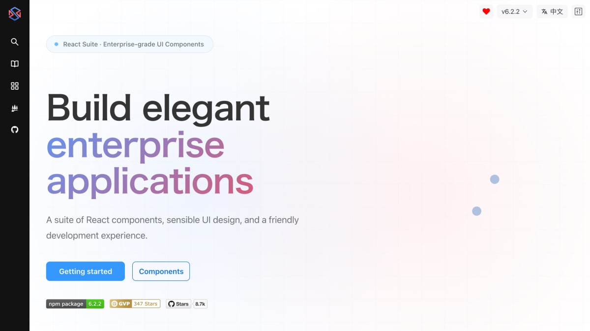
About React Suite
React Suite is a React UI component library with more than 80 components covering forms, data display, navigation, and feedback, aimed at building enterprise applications. It includes a CSS variable-based theming system with dark mode support, built-in internationalization for multi-language applications, and adherence to WAI-ARIA accessibility standards. The component set is built on a responsive, 24-column grid system that adapts across desktop, tablet, and mobile devices.
The ecosystem around the library includes project templates for build tools such as Vite, Next.js, and CRA, along with design resources including a Figma design system, a theme palette tool, and over 200 component icons. It also provides a Model Context Protocol (MCP) server for integration with AI assistants.
The product is intended for developers and teams building enterprise-grade web applications who need a ready-made, themeable, and accessible component set rather than building UI primitives from scratch. Support channels include GitHub, Discord, Twitter, and Medium, with community contributions coordinated through OpenCollective.
Key features
- 80+ pre-built React components for forms, data display, navigation, and feedback
- CSS variable-based theming system with dark mode support
- Built-in internationalization for multi-language applications
- WAI-ARIA compliant accessibility support
- 24-column responsive grid system with adaptive components
- MCP server for AI assistant integration
Frequently asked questions
What build tools does React Suite support?
It supports Vite, Next.js, CRA, and other build tools with complete project templates.
Does React Suite support theming and dark mode?
Yes, it uses a CSS variable-based theme system with dark mode support for brand customization.
Is React Suite accessible?
Yes, it follows WAI-ARIA standards to ensure accessibility for all users.
Who is React Suite for?
It is designed for developers building enterprise-grade React applications.
Are there design resources available?
Yes, React Suite provides a Figma design system, a theme palette tool, and over 200 component icons.


SerpApi - Search API
SerpApi's Search API makes it easy and fast to scrape Google and other search engines.

Show your product to thousands of developers
· 100k monthly pageviews
· 7k newsletter subscribers
You might also like
Promptly
Productivity/AI/LibraryDiscover, create and share powerful prompts.
PromptPlanner
Productivity/AI/LibraryPrompt manager for Mac to organize, schedule, and copy reusable AI prompts.
React Bootstrap
Library/Programming/UIReact-Bootstrap replaces the Bootstrap JavaScript. Each component has been built from scratch as a true React component, without unneeded dependencies like jQuery.
Semantic UI
Library/Programming/UISemantic empowers designers and developers by creating a shared vocabulary for UI.
sigma.js
Library/ProgrammingSigma is a JavaScript library dedicated to graph drawing. It makes easy to publish networks on Web pages, and allows developers to integrate network exploration in rich Web applications.
Supabase UI
Library/Programming/UIAn open-source UI component library inspired by Tailwind and AntDesign.