Radian UI
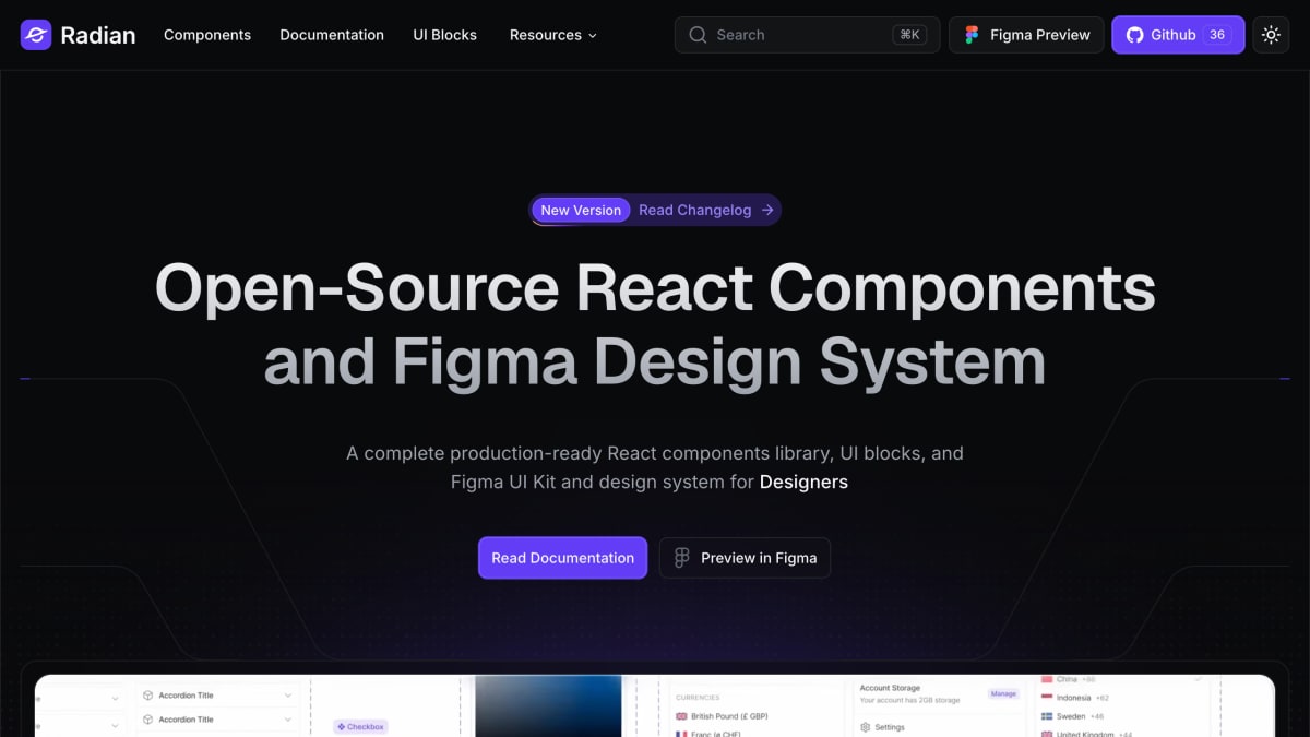
Open-source React components and Figma design system for Designers and Developers building modern web applications.
About Radian UI
Radian UI is an open-source component library that provides production-ready React components alongside a Figma UI Kit and design system. The React library includes over 50 pre-styled components built with Tailwind CSS, distributed for copy-and-paste use, with properties designed for customization. The Figma UI Kit includes over 2000 components and 1000 assets built with auto layout and Figma slots, covering text styles, color styles, variables (device, theme colors, color primitives, font family, radius, spacing), icon assets, and effect styles such as shadows and focus rings.
The product targets designers and developers, including startups and agencies, working on interface design and front-end implementation. It supports design-to-code workflows by using shared semantic tokens and variables between the Figma design files and the code components, and includes documentation, UI blocks, and animations alongside the component set. Individual component categories listed include checkboxes, inputs, buttons, dropdown menus, tabs, badges, accordions, alerts, avatars, banners, breadcrumbs, calendars, code areas, color pickers, credit card inputs, date pickers, and dialogs.
The page also references compatibility with AI coding assistants, describing the components and blocks as usable via prompts for AI-assisted development.
Key features
- 50+ pre-styled React components built with Tailwind CSS to copy and paste
- Figma UI Kit with 2000+ components and 1000+ assets using smart auto layout and slots
- Shared design tokens and variables synced between Figma and code
- Prebuilt UI blocks alongside individual components
- Components built to be flexible and accessible for production use
Frequently asked questions
What is Radian UI?
It is an open-source React components library paired with a Figma UI Kit and design system, aimed at designers, developers, startups, and agencies.
What frontend stack does it use?
Components are built with Tailwind CSS and are copy-and-paste React components.
Does it include Figma resources?
Yes, it provides a production-ready Figma UI Kit with over 2000 components and 1000+ assets built with smart auto layout and slots.
How do Figma and code stay in sync?
Variables and tokens in the Figma design file and the code use the same semantics for a smooth design-to-code workflow.


SerpApi - Search API
SerpApi's Search API makes it easy and fast to scrape Google and other search engines.

Show your product to thousands of developers
· 100k monthly pageviews
· 7k newsletter subscribers
You might also like
Photopea
Design/UI/TemplatePhotopea Online Photo Editor lets you edit photos, apply effects, filters, add text, crop or resize pictures.
Prime
UIUltimate UI Framework.
Pttrns
Design/Inspiration/UICheck out the finest collection of design patterns, resources, mobile apps and inspiration.
Radix
Icon/UI/DesignComponents, icons, and colors for building high‑quality, accessible UI. Free and open-source.
React Bits
Programming/UI/AnimationA large collection of animated React components made to spice up your web creations. Animations, components, backgrounds, and awesome stuff with customization options as props.
React Bootstrap
Library/Programming/UIReact-Bootstrap replaces the Bootstrap JavaScript. Each component has been built from scratch as a true React component, without unneeded dependencies like jQuery.