


Material-UI
React components for faster and easier web development. Build your own design system, or start with Material Design.
About Material-UI
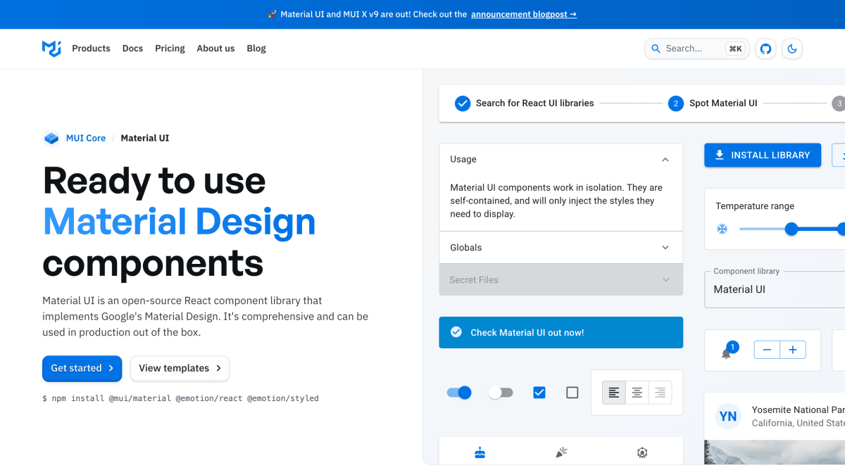
Material UI is an open-source React component library that implements Google's Material Design specification. It provides more than 40 ready-to-use, self-contained components — including buttons, text fields, tables, alerts, and tooltips — that inject only the styles they need and can be used in production without additional setup. It is installed via npm as separate @mui/material, @emotion/react, and @emotion/styled packages.
The library includes a theming system that lets teams apply custom design tokens and branding on top of Material Design defaults, as well as CSS utilities (MUI System) for applying theme-based styles directly through component props, including responsive styles tied to theme breakpoints. It is part of a broader family of products from the same organization, which also includes Base UI (unstyled accessible components) and MUI X (advanced components for complex use cases), along with paid templates and a Figma design kit with a sync plugin for generating theme files from design tokens.
Material UI is intended for developers and product teams building React applications who want a Material Design-based component system that can be customized to match a brand's look and feel. As of this page, it implements Material Design 2, not Material Design 3.
Key features
- 40+ ready-to-use Material Design React components (buttons, tables, alerts, tooltips, etc.)
- Advanced theming to customize components with your brand's design tokens
- CSS utility system (MUI System) for styling with theme tokens and responsive breakpoints
- Figma Design Kit and Sync plugin to bridge design and development workflows
- Fully built templates for dashboards, landing pages, and e-commerce
Frequently asked questions
How do I install Material UI?
Install it via npm with `npm install @mui/material @emotion/react @emotion/styled`.
Does Material UI support Material Design 3?
No, Material UI currently adopts Material Design 2; Material Design 3 support is tracked in a GitHub issue.
What framework does Material UI work with?
Material UI is an open-source React component library.
Can I customize the look and feel of the components?
Yes, Material UI offers advanced theming so you can use your brand's design tokens and tailor components to your needs.
Are design resources available for designers, not just developers?
Yes, a Figma Design Kit and Sync plugin are available to generate a Material UI theme file from Figma customizations.

SerpApi - Search API
SerpApi's Search API makes it easy and fast to scrape Google and other search engines.

Show your product to thousands of developers
· 100k monthly pageviews
· 7k newsletter subscribers
You might also like
Mantine
Library/Programming/UIReact components and hooks library with native dark theme support and focus on usability, accessibility and developer experience.
Markstream
Library/Open Source/UIStreaming Markdown renderers for AI chat interfaces across Vue, React, Svelte, Angular, Nuxt, and Next.js, with diagrams, math, code, and safe HTML.
Material Design
Library/Programming/UIBuild beautiful, usable products faster. Material Design is an adaptable system—backed by open-source code—that helps teams build high quality digital experiences.
Materialize
Library/Programming/UIMaterialize is a modern responsive CSS framework based on Material Design by Google.
morris.js
Library/ProgrammingMorris.js is the library that powers the graphs on http://howmanyleft.co.uk/. It.
n3-charts
Library/ProgrammingAwesome charts for Angular.