

Indie UI
UI components with variants.
About Indie UI
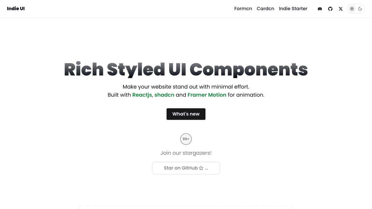
Indie UI is a component library providing pre-built React UI elements for building websites and SaaS products. It is built with React, shadcn, and Framer Motion, and includes components such as buttons, inputs, cards (including multi-layer, image, and pattern variants), loaders, separators, bento grids, and text animation effects (gradual spacing, typing effect, staggered fade, pull-up, blur-in). Each component includes a "get code" option for direct use.
The product is part of a small family of related tools referenced on the page, including Formcn, Cardcn, and Indie Starter. It is aimed at developers building React-based websites who want styled, animated UI components without building them from scratch.
Key features
- Copy-paste styled React UI components (buttons, inputs, cards, loaders, separators)
- Built with React, shadcn, and Framer Motion animations
- Animated text effects (gradual spacing, typing, letter/word pull up, fade in/blur)
- Bento grid layout components
- Interactive and multi-layer card variants with hover effects
Frequently asked questions
What is Indie UI built with?
It is built with React, shadcn, and Framer Motion for animations.
How do I use the components?
Each component has a "Get code" option so developers can copy the code directly into their project.
What kind of components does Indie UI offer?
It offers buttons, inputs, cards, loaders, separators, bento grids, and animated text effects.
Who is Indie UI for?
It is aimed at developers building React SaaS products who want styled, ready-made UI components.

SerpApi - Search API
SerpApi's Search API makes it easy and fast to scrape Google and other search engines.

Show your product to thousands of developers
· 100k monthly pageviews
· 7k newsletter subscribers
You might also like
Framer
Prototyping/UI/Website BuilderStart your website with AI and design on a familiar canvas. Add animations, interactions and a CMS. Optimize for every breakpoint — no code needed and publish for free.
GenDesigns
Design/AI/UIAI Mobile App Design Generator.
Godly
Design/Inspiration/UIGodly is a curation of the best web design inspiration, every day. Browse the best e-commerce websites, portfolio websites, animation websites and more.
Kometa UI Kit
Library/UIA marketplace of fully responsive, multi-purpose UI kits, built with Tailwind CSS, for start-ups and products of any kind.
Land-book
Design/Inspiration/UIDesign gallery with the best and most carefully collected websites. We help creatives find inspiration & motivation to do rad stuff.
Lapa Ninja
Design/Inspiration/UIThe best landing page design inspiration from around the web. Lapa Ninja is created to help designers find inspiration, learn and improve design skills. The contents are selected from the best designs, and daily updated.